I Tested 200 Startup Apps. These 5 Usability Bugs Appeared in Almost All of Them.
After testing 200+ startup apps over the past few years, I started noticing patterns.
Not random bugs. The same five usability problems — showing up in app after app, startup after startup.
These aren’t crash bugs or broken APIs. They’re quiet bugs. The kind your team never notices because you know how the product works. But your users don’t.
And they’re silently killing your conversions, your onboarding, and your retention.
Here they are.
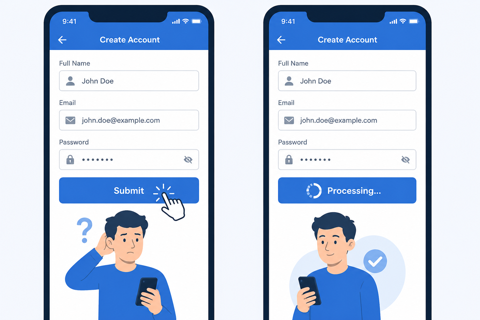
Bug 1: The Silent Submit
What it looks like: User clicks “Submit”, “Pay”, or “Sign Up”. Nothing changes on screen. No spinner. No disabled button. No feedback of any kind.
They wait 2 seconds. Nothing. They click again.
Now you have a duplicate order, a double charge, or two accounts created with the same email.
Why it happens: The API call is running in the background — but the UI doesn’t show it. The developer knows it’s working. The user has no idea.
Why it matters: This is one of the most common causes of duplicate payments and support tickets we see. Users aren’t impatient — they’re just acting on what the interface tells them. If the interface says nothing, they click again.
The fix: Disable the button immediately on click. Show a loading spinner. Confirm success with a visible message. Three lines of code. Massive difference.
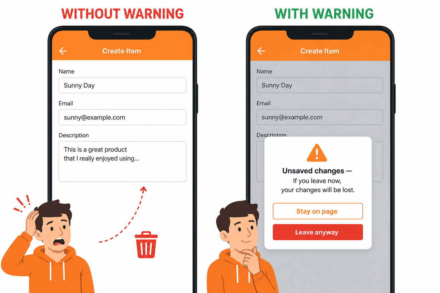
Bug 2: Unsaved Changes Disappear Silently
What it looks like: User spends 10 minutes filling out a form — project details, preferences, a long description. They accidentally click a link or hit the browser back button. They come back.
Everything is gone. No warning. No recovery.
Why it happens: Most teams build the happy path: user fills form, user submits form. Nobody tests the “user gets distracted halfway through” path.
Why it matters: This one doesn’t just frustrate users — it destroys trust. A user who loses their work once rarely comes back to redo it. They leave and tell someone else the app “lost their data.”
The fix:
Add a browser beforeunload warning for unsaved changes. Auto-save drafts where possible. It takes less time to build than the support tickets it prevents.
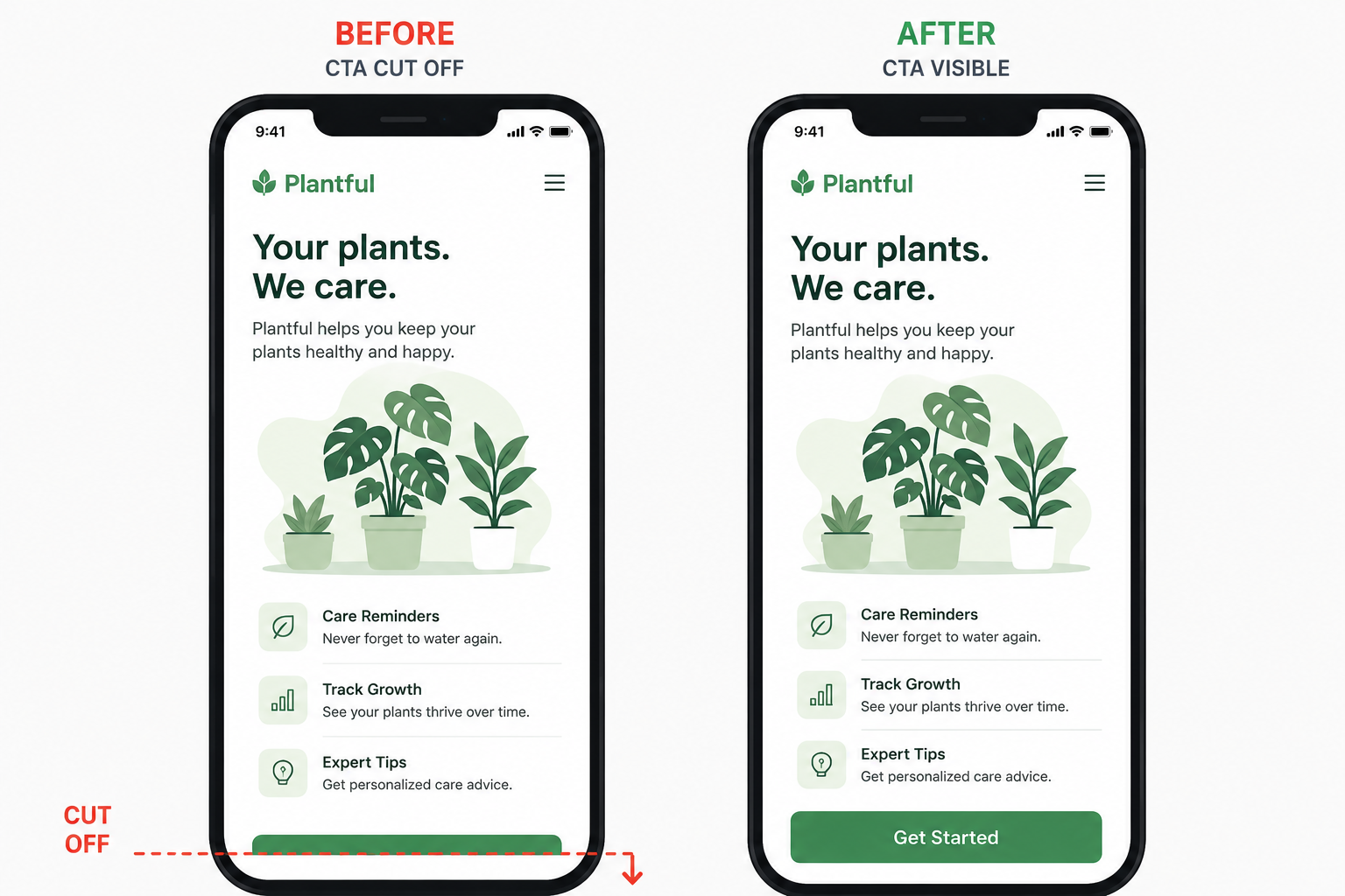
Bug 3: The Invisible CTA on Mobile
What it looks like: Your landing page or checkout flow looks perfect on desktop. The “Get Started” button is right there, above the fold, impossible to miss.
On iPhone, the button is below the fold. Hidden. Users don’t scroll — they bounce.
Why it happens: The team designs and tests on desktop. Mobile is an afterthought. Or it’s tested on a large Android phone but not checked on iPhone SE or smaller screens.
Why it matters: More than 60% of web traffic is mobile. If your primary CTA isn’t visible without scrolling, you’re losing more than half your potential conversions before they even see the button.
The fix: Test every key page on a real device — not just browser dev tools. Check iPhone SE (the smallest common size). If the CTA isn’t visible on first load, move it up.
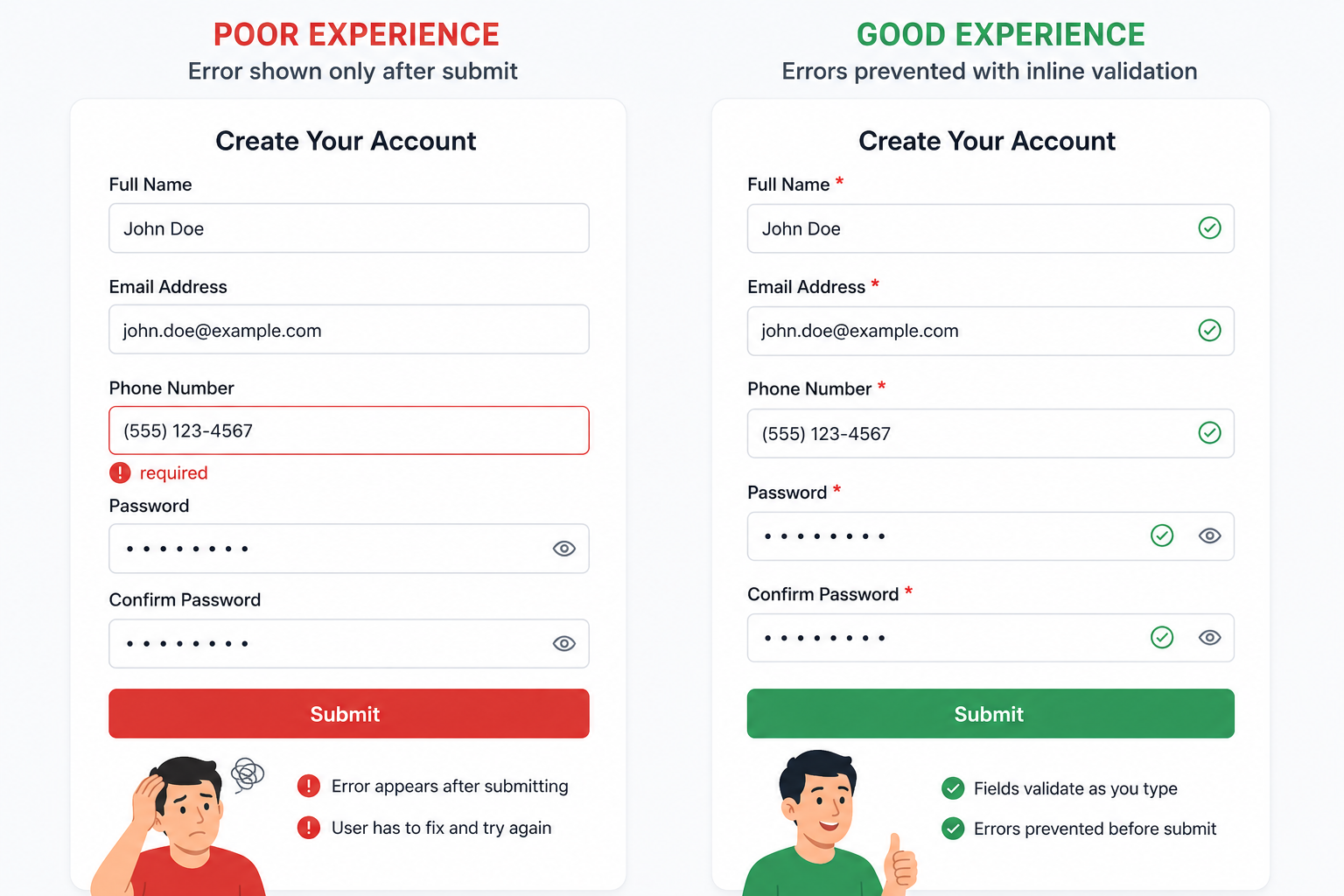
Bug 4: Required Field Revealed Only After Submit
What it looks like: User fills a 8-field signup or onboarding form. They get to the end and click Submit.
Error message: “Phone number is required.”
There was no asterisk. No indication it was required. They scroll back up to find it — now the form has cleared half the fields.
Why it happens: Validation logic runs on submit, not inline. Required fields aren’t visually marked. Nobody tested the form as a first-time user who doesn’t know what’s expected.
Why it matters: Every extra step between a user and their goal is a drop-off point. Revealing requirements after submit is the equivalent of telling someone the dress code after they arrive at the party. It’s fixable, but the damage is done.
The fix: Mark required fields clearly upfront. Validate inline as users fill each field. Never clear valid fields when showing an error. Test the form with someone who has never seen it before.
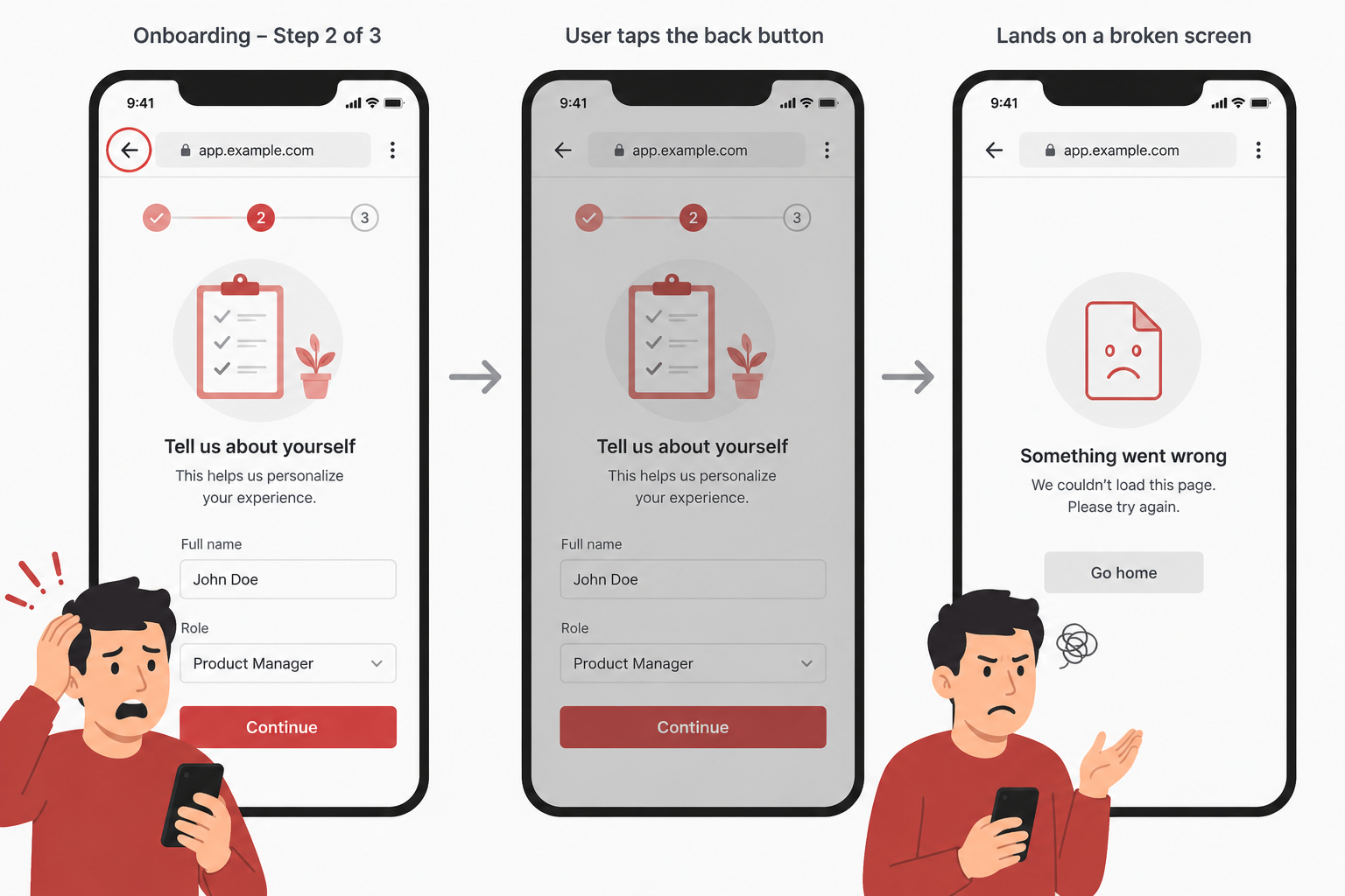
Bug 5: The Back Button Breaks the App
What it looks like: User completes step 2 of a 3-step onboarding flow. They hit the browser back button to check something on step 1.
The app crashes. Or they get logged out. Or they land on a completely unrelated page. Or the whole flow restarts from step 1.
Why it happens: Multi-step flows are built assuming users go forward. The back button is a browser-level control that many apps don’t handle at all. Developers test the intended flow — not what happens when users deviate from it.
Why it matters: Users expect the back button to work. It’s the most instinctive navigation behaviour on the web. When it breaks, users feel like the app is broken — because it is.
The fix: Test every multi-step flow by hitting back at each step. Handle browser history properly in your routing. Make sure state is preserved or recovered gracefully.
What a Real Bug Report Looks Like
These aren’t just observations — when we test your app, every issue gets a documented bug report. Here’s an example for Bug 1:
Bug Title: Double form submission possible — no loading state on Submit button
Severity: High
Steps to Reproduce:
- Navigate to the signup page
- Fill in all required fields
- Click the “Create Account” button
- Immediately click it a second time before the page changes
Expected Behaviour: Button is disabled after first click. A loading indicator is shown. Only one account creation request is sent.
Actual Behaviour: Button remains active after first click. Two identical POST requests are sent. Two accounts are created with the same email address.
Environment:
- Device: iPhone 16 Pro
- Browser: Chrome 124
- OS: iOS 18
Screenshot / Recording: [attached]
Every one of the 5 bugs above generates a report like this — with exact steps, environment details, and a recording so your developer can reproduce it in under 2 minutes. If you want to learn how to write these yourself, read our guide on QA testing on a zero budget.
Why Your Team Keeps Missing These Bugs
None of the five bugs above are subtle. They would be obvious to a first-time user within the first few minutes of using the product. And yet they appear in the vast majority of startup apps we test — built by talented teams who care about quality.
The reason isn’t negligence. It’s familiarity.
When you’ve built a product and used it daily for months, you stop experiencing it the way a new user does. You know to wait two seconds after clicking submit. You know not to hit the back button during onboarding. You know which fields are required because you wrote the requirements. Your mental model of how the product works fills in the gaps that the product itself doesn’t communicate.
Your users don’t have that mental model. They arrive with the expectations formed by every other product they’ve used. If those expectations aren’t met — if the button doesn’t respond, if data disappears, if navigation breaks — they experience it as the product being broken, regardless of what’s happening technically.
The only way to reliably catch these bugs is to test with people who don’t already know how the product works. This can be a professional tester, it can be a family member, it can be five users you recruit from your target audience. The specifics matter less than the genuine unfamiliarity.
The Difference Between Functionality and Usability Bugs
The five bugs in this article sit at the boundary between functionality and usability — and understanding that distinction matters for how you prioritise fixing them.
A functionality bug is when the software doesn’t do what it’s designed to do. The payment button throws a 500 error. The form data doesn’t save. The email never arrives. These are unambiguous failures of technical implementation.
A usability bug is when the software does what it’s designed to do, but the user can’t successfully accomplish their goal. The silent submit button is technically working — the API call fires and completes. But the user’s experience is that it doesn’t work, because the interface gives no indication that anything happened.
Both categories cost you users. Functionality bugs cost you users who hit them directly. Usability bugs cost you the users who never hit a technical failure — but who give up, confused and frustrated, before completing the action you needed them to complete.
The conversion impact of usability bugs is often larger than functionality bugs because they affect a broader population. A functionality bug might only appear under specific conditions. A usability bug like a hidden mobile CTA or an unremarked required field affects every user who encounters that screen.
Read our full breakdown of functionality vs usability testing if you want to understand how these two testing approaches complement each other.
Testing Your Own App for These Five Issues
You can check for all five of these issues yourself in under an hour. Here’s how.
Silent submit: Open your primary form on a slow mobile connection (enable network throttling in browser DevTools — use “Slow 3G”). Click submit. Count the seconds before any visual feedback appears. If it takes more than one second and the button remains active, you have this bug.
Unsaved changes: Fill a multi-field form halfway. Navigate away using the browser back button and the address bar. Come back. Is anything saved? Is there a warning before you leave?
Invisible mobile CTA: Open each of your most important pages on an actual phone (not the browser dev tools simulator — your real phone). Without scrolling, can you see the primary action button or link? If not, it’s below the fold for mobile users.
Required field surprise: Find someone who has never seen your signup or onboarding form. Watch them complete it. Don’t help them. Note every moment of hesitation or confusion. The required-field issue will typically surface within the first two minutes.
Back button: Go through your most important multi-step flow. At step two, hit the browser back button. At step three, hit it again. What happens to the state? What happens to the data you already entered?
If you find these issues during this test, they are almost certainly affecting real users right now. The fix for each is straightforward — typically a few hours of development work — and the impact on completion rates is usually immediate and measurable.
How to Know If Your App Has These
The honest answer: you probably won’t find them yourself. Not because you’re not technical — but because you know your product. You know where to click, what to expect, and how to use it correctly.
Your users don’t.
That’s exactly why we offer a free 5-bug audit. We’ve covered the full picture of functionality vs usability testing if you want to understand the difference before booking. We test your live app like a first-time user, document every issue we find, and send you a full report — no charge, no pitch.
Five spots available per week.
Ready to improve your QA Testing?
Let's talk about how we can help.
Book Your Consultation
Shalini Gupta
4.8/5.0 Top RatedQA Lead & Founder · The Moms Desk
ISTQB-certified QA lead with 15+ years across SaaS, fintech, health tech, and crypto. She has delivered 200+ projects for clients in the US, UK, and Australia — and built The Moms Desk to bring senior-level QA and product expertise to startups without the agency price tag.